
A Case for Color


Color is the main component of designing any space. Texture, shape and lighting definitely have a prominent place, as well, but color takes center stage with most design decisions. And, rightfully so.
Color not only creates the look of the space, but the feel. Color evokes the emotion of those who enter and dwell in a space. It’s a powerful tool, and one, by which, I’ve found most people are intimidated. “What if I commit to a color and then hate it?” “Will too much color make the room feel dark and cramped?” These questions are typical when selecting the look and feel of the home.
I, too, used to shy away from a lot of color, sequestering it only to textiles that were easily interchangeable. Some of this reason was financial - what if I don’t have the cash to fix a color faux pas? And, some of it was a lack of exposure to spaces I love that are draped in color.
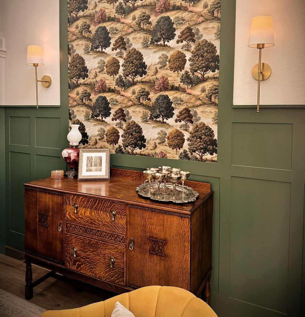
Having studied interior spaces, textiles and colors for quite some time now, I have become a huge advocate for designing spaces filled to the brim with color. All you have to do is look at nature to see the vast array of colors that landscape our world. They blend together effortlessly and ground us, as the viewer. Is it risky to go with more color? Absolutely. But is it worth it? Absolutely. Think of it as a vacation. You can go to the same beach and the same condo year after year, knowing it works and is tried and true. Or you could venture out a little further and book a trip to a place you’ve never been but always wanted to go.
Maybe you’re now convinced to the take risk, but now you’re wondering, “how do I choose the right color?”
Color preference and the feelings it invokes are subjective. Certain colors that overwhelm me may calm or energize another and vice versa. There are some color basics you need to know first before we get into how you can utilize this knowledge to select the perfect colors for your space.
Cool colors are blues, greens and purples. They usually are more calming in tone and blanket nature. Warm colors are reds, oranges and yellows. These colors are more energetic and inspire you to action. Nature is peppered with pops of these colors.
When selecting color for your space, take note of the colors with which you come into contact. My mom and I used to look at magazines together when I was younger, and we would discuss what we loved on each page. Firstly, this made me focus on the positive - what I like about a space - rather than the negative (a good life lesson in general). Secondly, this made me be able to articulate why I respond positively to a space. Did I like the picture because there was a beautiful bouquet of lilacs on the table? Or did I like the picture because it looked lived-in, unique and cozy? Expose yourself to as many interior photographs and spaces as possible so you are able to really decipher what colors and styles makes you tick. Pinterest is perfect for this, as are home magazines.
With each picture or space, note what you feel when you look at that color. Sadness, energy, tranquility, anger, energy? We often view color through the lens of our experiences. So, what memories pop into your head, if any? As you begin to observe color and how it affects you, you will see patterns emerge. Write these down. This will give you a direction as to which colors you respond positively.
For me, personally, I am naturally energetic, so I stay away from colors that make me even more hyped-up. I surround myself with cool colors I find soothing but add pops of energetic colors to provide contrast and create visual interest. I do this in the form of floral arrangements and antique plates or baskets. A touch of interest without overwhelming my senses.
Once you hone in on the colors you love most, look at the shades, tones and tints of those colors. How do you respond to the varying saturation? Are you drawn to a lighter tint? A darker shade? Shade is a hue of color with black added in to make it darker. Tone is the hue of a color with gray added to make it appear more muted. Tint is the hue of a color with white added in to lighten the hue.
Once you narrow down these specific preferences, you can begin looking at paint samples. And, I cannot stress this enough - get samples!!! Color is simply light that is reflected back to our eyes, so lighting plays a HUGE part in the way a color will look or feel. I always recommend buying physical paint samples and painting on different walls in a space where the light changes. Observe the painted wall sample at different times of the day. If your color selection has to do with tiles, then make sure you secure the necessary samples and view them in the space at different hours. Lighting and the color of other objects and textiles in the room will drastically affect the way the color looks.
Color infuses life and joy into any space and will create that curated, bespoke and lived-in look we all long to attain. Don't let fear or comfortability prevent you from playing with color. I will warn you, though. Once you start to use varied colors more frequently, you won't be able to stop! Happy designing!


Comments